 |
| Sears New Haven model • 30 Hawthorne Avenue, Delmar, New York |
 |
| Sears New Haven model • 1931-32 Modern Homes catalog |
It is certainly not every day that we run across a Sears New Haven model! In fact, this is only the second one on our National Database of Sears Houses in the U.S. I can't take credit for finding this through extensive research... I ran across it while browsing real estate listings that mention Sears. Quite often, those listings are incorrect, showing simply a Craftsman house, and mistakenly connecting that term to Sears, or, if we're lucky, it's at least a kit house by another company, and we figure that out. It's always fun to find a kit house, no matter how it happens.
But, this house does seem to be a Sears house, and it certainly matches well with the New Haven model catalog images. The real estate listing mentions there being "original Sears and Roebuck builder's plans" available to see, though they, unfortunately, did not show an image of them in the listing.
 |
| snippet from the real estate listing, available here |
From what I was able to see of the inside, there are definitely areas that seem to match up well with the layout of the
New Haven. We recently saw another real estate listing, in Ohio, that looked, on first glance of the outside, like it might be a
New Haven, but a look at the interior, at the entry area and around the staircase, showed that it differed a good bit from the expected layout of the
New Haven. All of that helped reinforce for us that this house, which matches well, is probably a
New Haven.
 |
| Here's the full floor plan of the Sears New Haven, as shown in my 1931-32 Sears Modern Homes catalog. |
The Front Door
One very distinctive element of the Sears New Haven, is this massive, rather intricate, doorway surround. It's unlike anything on any of the other Sears houses. It has a definite colonial look, but is more elaborate than the two simpler doorways marketed by Sears as Colonial Doorways, this one having dentil work and sharp cornice returns with thick, tapered moulding, a keystone, a fanlight, sidelites, and pilasters. It's beautiful.
 |
| The New Haven's colonial entry of 30 Hawthorne Avenue, Delmar, New York |
Here are two of the simpler options that Sears offered as Colonial Doorway options. We often see the one on the left, on the later-years Lexington, and the one on the right, on the early-years Lexington. These are both really porticos, not just doorway surrounds, providing a small covered area over the front porch, right in front of the door itself. The New Haven's entry is almost flat against the house, providing no overhang.
 |
| Sears Colonial Front Entrances, offered in the 1930 Building Materials catalog (source) |
Here is the later years Lexington, sporting the Colonial Front Entrance shown on the left, in the catalog. This one is in Flint, Michigan:
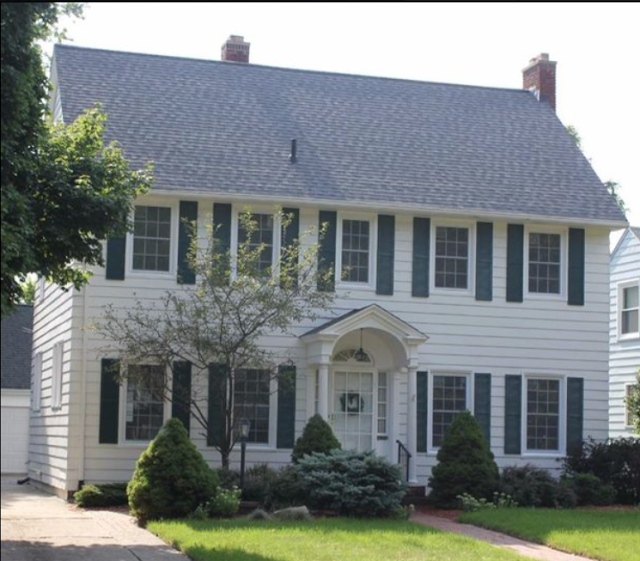 |
You can see a little more about this Flint, Michigan Lexington, near the end of this blog post of mine,
about a Lexington in St. Louis. |
Here is the very elegant earlier version of the Sears Lexington, in the 1923 Modern Homes catalog, with what looks like an enlarged version of the other Colonial Front Entrance that Sears included in their catalogs:
Here is a comparison of the front doorway as shown in the catalog image of the New Haven, and on the house at 30 Hawthorne Avenue:
 |
| Pretty nice match for this rather intricate doorway design, that is unique to the New Haven. |
EDIT: Researcher Cindy Catanzaro pointed out to me that this looks to be about the same beautiful colonial entrance that is used on the very rare Sears Jefferson model. We've only found two so far, and you can see them both on Cindy's blog post about the Jefferson she found in Ohio.
 |
| You can just make out that this seems to be the same doorway style. This is the Jefferson in Ohio, that Cindy Catanzaro found. |
The Haverhill, offered from about 1933-1940, also used the front entry that the New Haven used. Here it is in the 1938 catalog:
Inside The Main Entrance
Here is a lovely shot, from
the real estate listing (the source of all of the house photos in this blog post), showing the entry hall and staircase. A comparison to the first-floor floor plan, shows how well it matches the various doorways and walls of the area:
 |
| Click the image to get a much larger view |
Here is the view from the back of this hallway, looking toward the front door:
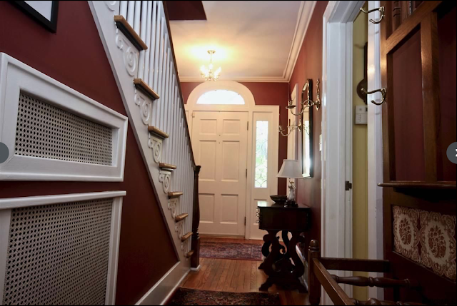 |
| Front entry hall of the probable Sears New Haven, in Delmar, New York |
The Living Room
The listing's view of the living room shows that it matches up nicely with the floor plan. We can see the fireplace where it should be, and the single window to the right of it, as well as the correct placement of the entry into the dining room. We can even see the one window visible on the dining room wall on that side of the house.
 |
| Click the image to get a much larger view |
Front Powder Room
Another view from the living room, shows the entry to what the floor plan quaintly refers to as the Vanity Room. It's another non-standard aspect of this home's design... we normally just see a good old bathroom, with no silly re-phrasing. As you can see on the floor plan, the original design does show a separate little window for the toilet portion of the Vanity Room, and then a window in the Vanity Room itself. It looks like this house has simply one big window there.
 |
| Entry to the Vanity Room, as seen from the living room |
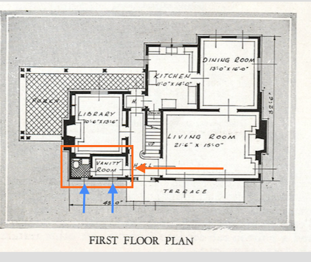 |
| The two front windows of the Vanity Room on the Sears New Haven |
On our one other example of the Sears New Haven, in State College, Pennsylvania, we do see the correct two-window look in that front spot of the house:
 |
| Front view of the Sears New Haven in State College, Pennsylvania, at 432 West Fairmount. My apologies, but I do not know which researcher originally located this house, but I do know that we reference an online brochure about the kit homes in this town, which you can see here. |
Here is that area on the Delmar, New York house:
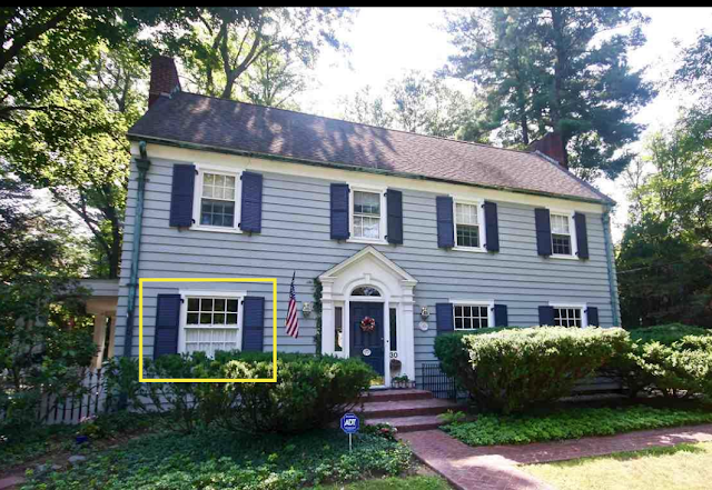 |
| The Vanity Room area of the New Haven. This area should normally have two smaller windows, according to the floor plan. |
The other first-floor front windows are nice and large, but the catalog image for the New Haven shows even larger windows there, reaching to the ground, that almost look like French windows. That makes for an elegant look, but the Delmar, New York house (and the State College, PA house) has maybe a more cohesive look there, with all three first-floor front windows being the same:
 |
| Front elevation of the Sears New Haven, as shown in the 1931-32 catalog |
 |
| Here's a comparison, showing how the Delmar, New York's New Haven has slightly smaller windows. |
Dining Room
The dining room windows and entry into the kitchen seem to show everything in place to match the floor plan of the New Haven in that area:
 |
| Click the image to get a much larger view |
Here's another view of the lovely dining room, from the back of the room:
 |
|
The Upstairs
The second floor seems to follow nicely along with the
New Haven floor plan, as well. This is such a beautiful home. Here is one spot upstairs, where we can see into the entry of the bathroom, and into the front bedroom on that left side of the house:
 |
Upstairs, left side of the house, showing the entries of the left front bedroom, and the bathroom at the end of the hall
(Click the image to get a much larger view) |
Here is that bedroom, followed by the bathroom, which retains its original character:
The floorplan shows a master bedroom, in the front of the house, with an actual master bathroom and a dressing room. From what we can see into that first space off of the master, it looks like they have created a whole master bath out of that area:
So, the pretty pale yellow area here, is what is shown as "Dressing Rm" on the floor plan:
 |
| The master bath areas in the New Haven in Delmar, New York |
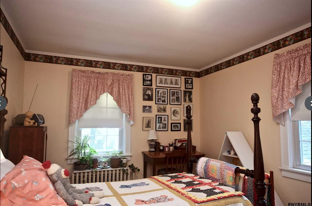
The upstairs finishes off with two more bedrooms, in the back, with the larger of them being used as an office / library space, and their configuration and window and door placement seems to follow well with the upstairs floor plan:
 |
| The floor plan for this room shows these windows on these two walls. |
 |
| That window and the little closet, are shown in those spots on the floor plan. |
 |
| And... looking back out into the upper hallway. This door and window are correctly placed for the New Haven's floor plan. |
If you're interested in knowing more about where in New York State this is, I can tell you that
Wikipedia describes Delmar as a "hamlet in the town of Bethlehem, in Albany County" and that area is a suburb of the large city of Albany. All of this is well up into New York State, just west of the eastern edge of Massachusetts, and just south of the bottom of Vermont.
Sears was very active in New York state, and so were other kit house companies, including Wardway and Bennett. I've blogged previously about a
Sears Kilbourne and a Wardway Devonshire, also in Delmar (actually, in Elsmere, apparently), and those two are just shy of two miles from this house. Researcher
Andrew Mutch has found about eight more Sears models in the Delmar area, including
this Lewiston, this
Argyle, this old
No. 114 (later called the Concord), this probable
Lynnhaven, this
Whitehall, this very nice
Winona, and, finally, this Sears
Hammond model.
I would love to know who was the original owner of this house! If you happen to be the current, or new owner,
please contact me -- the original owner's name might well be listed on the blueprints that are being sold with the house.


The Jefferson door framing is a lot smaller than that of New Haven door. I've seen the Jefferson door on two different Sears models in the Chicago area and it's not nearly as elaborate as the New Haven one. Also it doesn't have sidelights.
ReplyDeleteI bet we'll see that New Haven door again on another model somewhere. Thanks for the informative post!
I agree -- I noticed that the New Haven's door surround is more elaborate... it's just beautiful.
DeleteThanks for the comment pointing that out, Lara!
Excellent post - as always! I love to see the interiors of these homes, particularly when they are so close to being original to the plan.
ReplyDeleteI have an observation and a question about it. In the dining room photo, from inside the room, looking out to the living room - there are those ubiquitous corner China cabinets, one on each side of the doorway. But, they couldn't possibly be more dissimilar! Well, maybe, if they were both painted different colors, or one had solid doors without glass in them, but for the styles, they are very different, one from the other. I have not noticed this as any kind of trend, in any other of the hundreds (thousands?) of Colonial style homes that saturate the areas of Virginia in which I was raised. In fact, when these are present in the dining room corners, which is most of the time, there are two, one on each side of the main doorway to the living room, like these are, but they are always identical! Not heavily mismatched like the ones in this photo. Do you see this any more often than I have? Any ideas why they might have been done this way?
And - no real views of the kitchen? �� Perhaps in the listing itself? I will go there and look.
Yeah, they sure are different! Must mean that one was added later, don't you think?
DeleteOh, also meant to say that I have definitely seen houses with only one corner hutch in the dining room. My parents' house, for example :)
Delete