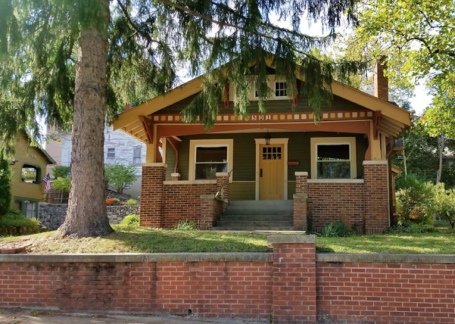
 |
| Sears Mitchell • 4616 Arlington Avenue, Fort Wayne, Indiana |
 |
| Sears Mitchell • 1932 Sears Modern Homes catalog |
This is the first time that I have blogged about the Sears Mitchell model. That might be because it is a model that has such close lookalikes, that I am rarely confident that the house in front of me is, in fact, the Sears model.
But, today, we have a beautiful real estate listing for a Mitchell that was found in Fort Wayne, Indiana, during a house-hunting weekend that several of our researchers were involved in. I understand that the group was headed down this street to see a Sears Barrington, and drove right by this house, and it was Dale Wolicki who spotted it as they headed back up the street. Ha! We all thought that was pretty funny, considering that there were probably quite a few avid Sears house minds--and eyes-- in the car at the time.
There are quite a few little things to look for (on the exterior) when trying to pin down that a model like this is a Sears Mitchell, and not one of the lookalikes sold by Gordon-Van Tine, Wardway, Aladdin, Bennett Homes, or Home Builders plan book. The side windows -- on both sides-- are a huge key factor. Sometimes, though, it's hard to get a good look at both sides. There are some other distinguishing features in the front of the house, too. I'll try to explain them all.
But, first... take a look at this door on the house on Arlington Street, in Fort Wayne! This is, without a doubt, a Sears door. It's a perfect example of what we call, "Sears curlycues". See the hinge edge of the door? That curly look? That was only on the decorative iron strapping of Sears doors. So, if se see that on a house that looks like a model from the catalogs, we know it's authentic.
 |
| Sears door with trademark Sears "curlycue" decorative iron strapping, on our Mitchell in Fort Wayne. |
There is one other company that we have found, that offered decorative iron strapping with a curly edge, and that is the McKinney forged iron company, based in Pittsburgh. Their iron strapping options were advertised in a big Home Builders plan book that I have, from 1929. The curl is slightly less pronounced than the Sears curl, but the definite difference is at the other end: McKinney's strapping has a little hook at the other end. Sears' strapping has a pointy tip, kind of like the tip of a fat arrow. All of the other companies used iron strapping that did not have curylcues at the hinge edge, in any fashion.
 |
| See the difference there at the end? |
What's On A Mitchell?
First, let's take a look at what to expect on the front of a Mitchell. Not all companies have all of these features. Some have most of this, some have all of this, some are clearly different here.
 |
| See the right side here, with 2 windows, then 1, 1, 1 ? Well, the Wardway/Gordon-Van Tine version has one fewer windows on this side (2, 1, 1). |
 |
| The Fort Wayne Mitchell looks good from this angle (reversed floor plan, of course). |
The real test of a Mitchell, is the set of windows on the long side of the house... so, if you're looking at the catalog image, it's the left side of the house. On this Mitchell, since it's reversed, it's the right side elevation of the house.... which we can't really see in any of the photos. But, for this house, the door clinched it for us, so we know it's a Mitchell. I'll use the floor plan, and another house, to show you what we're looking for.
Here's an infographic that I've turned to many times, made by Andrew Mutch:
 |
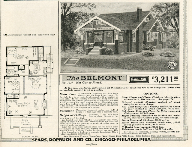
That single window should be right up close to that bumpout, and the triple windows within the bumpout, should have plenty of space before you get to them, just like you see here. Other companies are different here. Aladdin's University model has a single window, but it's more centered in that area... not quite as close to the bumpout, and, within the bumpout, there are only two windows, also set back toward the back of the house. Gordon-Van Tine's Patrician, and Wardway's Newport, have a whole triple set of windows there in that first space (that's the living room, for all of the models), and then only a double, in the bumpout. The Bennett Homes Brentwood looks the most like the Mitchell: it has a single window, but it's not quite as close to the bumpout a the Mitchell's single window, and the bumpout also has three windows in it, set back like the Mitchell's windows. The plan book lookalike, the Home Builders Elyria, is very different on this side of the house, because it has no bumpout... it is even for the whole length of that side of the house.
 |
| No bumpout at all on the living room side of the house! |
I was lucky enough to run across an Aladdin University this year, in Charleston, West Virginia, and to help myself figure out the differences, I looked at all of the windows on this side, and made this comparison:
Here's another house that shows this side of a Mitchell:
 |
| You can see what we expect, on both sides of the Mitchell, with these two photographs. Notice that front set of four long windows? |
On the image above, of this white Mitchell, did you notice that the 1932 catalog doesn't show windows like that... it just shows three wider windows? Well, the older catalog versions do show this kind of front window look:
 |
| The Sears Mitchell in its first year, 1928, had a stretch of 4 long, slim windows. |
 |
| Beginning in the 1930 catalog, up through 1939 (this image), the front windows are shown as three standard size windows. |
The Mitchell was first offered in 1928, and had a long run, all the way up into the 1940 catalog. It graced the cover of the 1929 catalog, and its brick-veneer twin, the Sears Stratford, starred on the front of the special Brick supplement catalog put out in 1929, also:
 |
| Sears 1929 Modern Homes catalog |
 |
| Thanks to our friend at Antique Home / Daily Bungalow, for this image, and the scans above: Sears Special Supplement, 1929, Brick Veneer Honor Bilt Homes |
Now that we've seen the floor plans for the competing companies, let's see their catalog images:
 |
| Aladdin Homes offered the University. (Source: 1936 Aladdin Homes catalog.) |
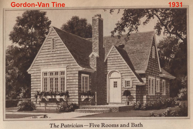 |
| Though Gordon-Van Tine and Wardway usually offered the same model, with a different name, you can see some differences in the look of the Patrician, vs the Newport, especially in the section over the front windows, and in the size of the window by the chimney (this window is absent on both the Sears Mitchell and Aladdin University). (Source: 1929 GVT catalog, on Daily Bungalow) |
 |
| Wardway's Newport, in their 1929 catalog. (Source: Daily Bungalow) Also note: Look at the top of the door, on both the GVT and Wardway models. Instead of being one solid, curved-top door, it is actually a squared off door, with a separate curved section just set in there. |
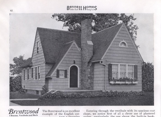 |
| The photo of the Bennett Homes Brentwood, is probably actually a Sears Mitchell...look at that door.... sure looks like Sears curylcue iron strapping! (Source: Bennett Homes 1937 catalog) |
 |
| It looks like the folks at Home Builders plan-book company, grabbed an image of the Sears Mitchell, as well... tell-tale curlycue iron strapping from Sears! |
Interior Of Sears Mitchell In Fort Wayne
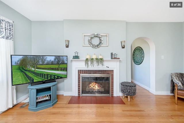
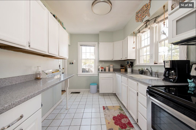
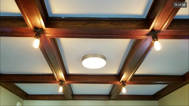
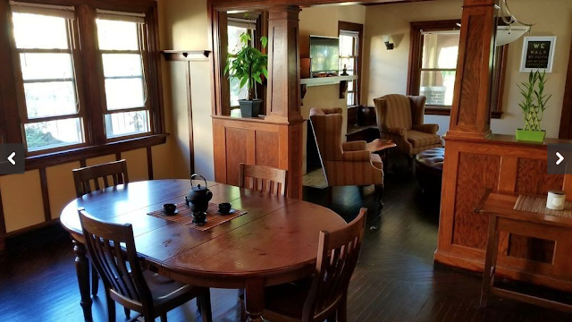
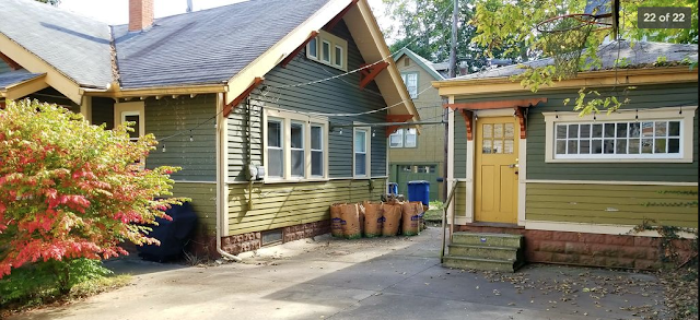
Finally, thanks to Andrew Mutch's scouring of real estate ads this weekend, we are treated to beautiful interior photos (click to enlarge) of the Sears Mitchell at 4616 Arlington Avenue, Fort Wayne, Indiana, thanks to this real estate listing:
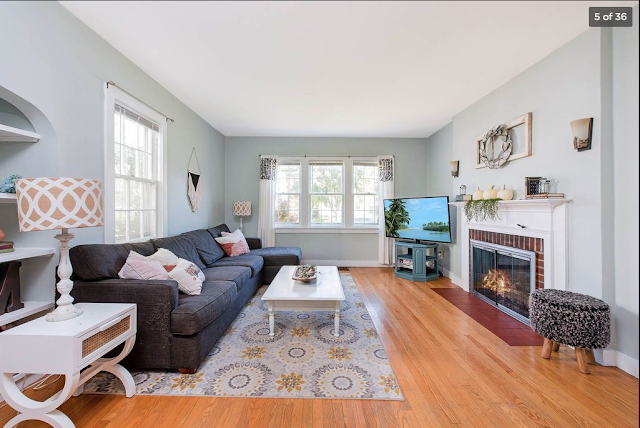 |
| These are the triple windows you see in the front of the house, and the window on the left is the single window on the bump out side. |
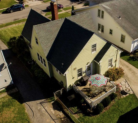 |
| This is the expected rear view of the Sears Mitchell. The Wardway Newport and GVT Kent/Patrician, have a slightly different look (see comparison photo further down in the blog post). |
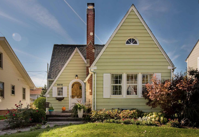 |
| Sears Mitchell • 4616 Arlington Avenue, Fort Wayne, Indiana |
Comparison Photos: Wardway Newport and Gordon-Van Tine Kent/Patrician
Here are photos from some houses that had Wardway mortgages, to show you the contrast with what the Sears Mitchell has.
 |
| This is the expected width of the recessed area, on the Wardway Newport or GVT Kent/Patrician. The recessed area here, in the Sears Mitchell, is twice as wide. The recessed area of the Bennett Homes Brentwood, is about this same width. Lara Solonickne blogged about this testimonial Wardway Newport, in January of 2016. Also note, here, that the windows next to the recessed area, are two full-sized windows, whereas we expect a short-height triple window here. |
 |
| Back bedroom. The Sears Mitchell has this 2nd window on the side wall. The floor plan of the Wardway Newport and GVT Kent/Patrician, shows only one window on this wall. |
•••••••••••••••••••••••••••••••••••••••••••••••••••••••••
For more information on who we are, and what we do, visit our website: SearsHouses.com
(NOTE: This blog is best seen in WEB view, to access the many informational links in the side bar.)


