Sunday, July 26, 2020

Sears Houses In High Bridge, NJ: Sears Argyle On Seal Street

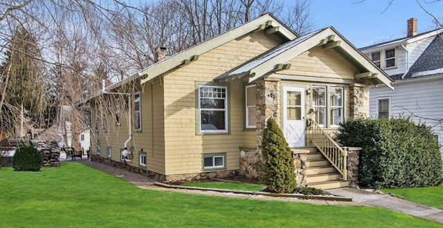
color image of front of Sears Argyle • 7 Seal Street, High Bridge, New Jersey
Sears Argyle • 7 Seal Street, High Bridge, New Jersey
The little town of High Bridge, New Jersey (Hunterdon County), packs a nice little punch when it comes to Sears houses. We don't really know how many are there, because very little of the town is viewable on Google maps Streetview or Bing Maps. But, thanks to the magic of real estate listings, we've run across a few charming examples. The houses that I'm going to highlight in this series are especially lovely because of their original detail, and interiors rich in Craftsman-style, unpainted, gleaming woodwork. Today's model is the Sears Argyle. Let's get started with our tour:

Sears Argyle • 7 Seal Street
Thanks to Andrew Mutch for spotting this one in the listings. We were all so pleased to see the great interior views, and wanted to save them for posterity.

color print image of Sears Argyle in 1921 Sears Modern Homes catalogue
Sears Argyle1921 Sears Modern Homes catalog

left side and front color image of Sears Argyle • 7 Seal Street, High Bridge, New Jersey
All of the windows and purlins match up nicely. 
The Argyle was first offered in the 1916 catalog (it's not in the 1914, and I've never seen a 1915 catalog), although in its first few years, it went by a number... actually, a series of numbers. The early 1916 catalog marketed it as the 264P245, offered for $827.00, or $867.00 if pre-cut; In the late 1916 catalog, it was marketed as C2018, as an already-cut-and-fitted kit, for $891.00, or C245, for $851.00, if you wanted standard-length boards, not pre-cut. Finally, it was given the name Argyle, when the 1918 catalog came out with names for the models.

black and white floor plan image of Sears Argyle in 1921 Sears Modern Homes catalogue
Floorplan of the Sears Argyle, from the 1921 catalogue.


Let's take a look at the interior of 7 Seal Street:
color image of living and dining rooms of Sears Argyle • 7 Seal Street, High Bridge, New Jersey

color image of living room and dining room of Sears Argyle • 7 Seal Street, High Bridge, New Jersey

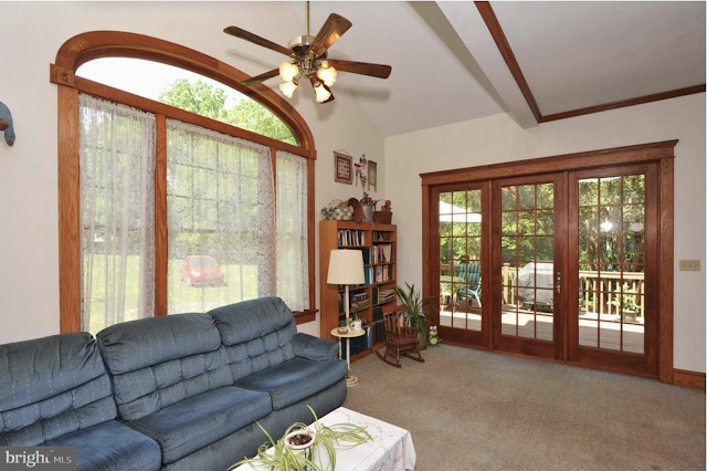
color image of living room of Sears Argyle • 7 Seal Street, High Bridge, New Jersey
The bookcase that we see here, to the side of the fireplace, came standard with the Argyle .

Sears Building Supplies catalog 1930 snippet showing built-in bookcase
From the 1930 Sears Building Supplies catalog

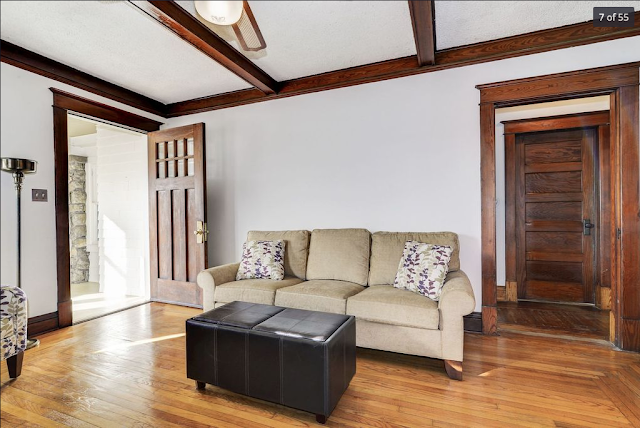
color image of living room, front door, side hall, and interior door of Sears Argyle • 7 Seal Street, High Bridge, New Jersey
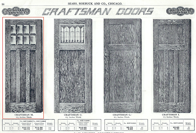
We see the Sears Craftsman-M front door here, and the Five Cross Panel interior door, standard with the Argyle.

Sears Craftsman style doors offered in Sears Building Supplies catalog 1918

white pine interior doors shown in Sears Building Supplies catalog 1918
These two images are from my 1918 Sears Building Supplies catalog, not available online.


color image of dining room of Sears Argyle • 7 Seal Street, High Bridge, New Jersey
The built-in bookcase with colonnade, came standard with the Argyle, but other models did not include it as a standard part of the package. However, the bookcases, with or without the colonnades, were an available extra-cost option.
Sears built-in book cases and colonnades Sears Building Supplies catalog 1930
The bookcase was available alone, or with the colonnade, and the trim pieces and header were separate costs. The glass fronts of the bookcases, also had several optional styles. Also, you could opt for shorter bookcases, with longer colonnades. This catalog page is from the 1930 Sears Building Supplies catalog.

color image of bump-out windows and ceiling of Sears Argyle • 7 Seal Street, High Bridge, New Jersey
This bank of four windows, is the bump-out that we see on the side of the house. Notice, too, the decorative ceiling beams in the dining room and living room.
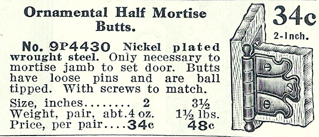
If you zoom in on the bookcase, you see what we call "The Sears Hinge". When we see this hinge, we know it is from Sears, as we have only ever seen this hinge in Sears houses. The cabinets and bookcases and doors came with a variety of hinges, so you don't always see this hinge.
color close up image of glass front and Sears hinge on bookcase in Sears Argyle • 7 Seal Street, High Bridge, New Jersey

Sears hinge distinctive design Sears Building Supplies catalog
Here is the distinctive design of what we call, "The Sears Hinge". Other hinges offered by Sears, were also offered by numerous other companies... but, not this one.

color image of bedroom and hall of Sears Argyle • 7 Seal Street, High Bridge, New Jersey
The style of trim that we see all over this house, is called Molded Cap Trim, one of the Craftsman style options that Sears offered. 
molded cap trim shown in Sears Building Supplies catalog 1930

molded cap trim described in Sears Building Supplies catalog 1930
These two snippets are from the 1930 Building Supplies catalog. The description above, describes how the window trim, and the door head trim, are pre-cut, and pre-finished (sanded and all pieces that make up the header, already nailed together). However, the side lengths of trim, for door trim, were shipped in one of two standard lengths, to be cut to size at the job site.

color image of bedroom and hall of Sears Argyle • 7 Seal Street, High Bridge, New Jersey

color image of left side view of Sears Argyle • 7 Seal Street, High Bridge, New Jersey
This side of the Argyle has a pretty distinctive pattern of windows.

color image of back view of Sears Argyle • 7 Seal Street, High Bridge, New Jersey
This enclosed back porch is not standard on the floor plan of the Sears Argyle.

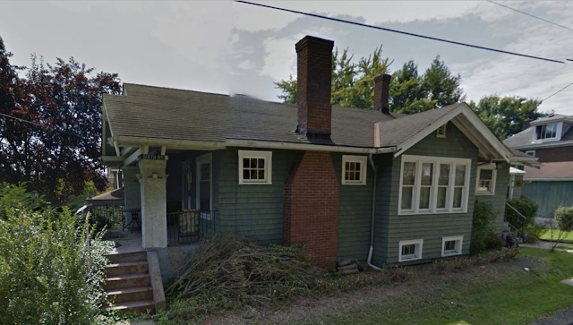
For some reason, we don't often get good shots of the bump-out side of the Argyle. You can only just barely see that bump-out in the last photo, above, of the Seal Street house in High Bridge, so here is that side on three other Argyles we've found around:
color image of right side of Sears Argyle in Clarion, Pennsylvania
This Sears Argyle is in Clarion, Pennsylvania. We see the standard bump-out, with its four  windows, with the main roof extending down over it. The windows look skinny in these photos, but, from the inside, you see that these are full-size windows. The bump-out area is the side of the dining room.

color image of right side of Sears Argyle in West View are of Pittsburgh, Pennsylvania
This beautiful Sears Argyle, with its original cedar shingle siding, has an added side dormer, and the house seems to be slightly heightened, allowing for an upstairs bedroom. This example is in the West View area of Pittsburgh.

color image of right side of Sears Argyle in Dravosburg, Pennsylvania
Occasionally, we run across a Sears Argyle like this one, in Dravosburg, Pennsylvania, with a peak roof over the side bump-out.

In the Catalogue
I've snipped these images from the Argyle's listing in the 1921 catalog:
black and white image of floor plan and description of Sears Argyle in 1921 Sears Modern Homes catalogue

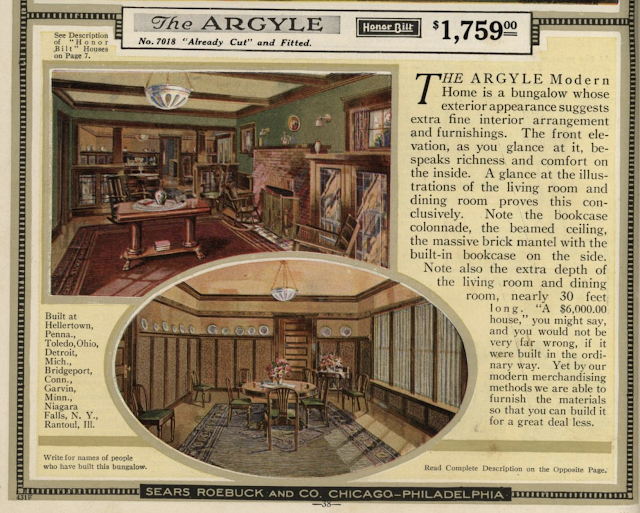
color print image of description of Sears Argyle in 1921 Sears Modern Homes catalogue

black and white print images of interiors of Sears Argyle in 1921 Sears Modern Homes catalogue


More About The Interior Trim
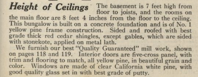
In the next two snippets from the catalogue page, you see mention of the millwork (interior doors, windows, window trim, and floors) all being (standard) in yellow or white pine. But, in the options, we see that oak doors, trim, and floors are an available upgrade, for an additional charge. I'm not a wood specialist, but I do want to point out that when we see painted trim, it often upsets people, who assume that gorgeous oak wood was painted over. But, in reality, many Sears houses (and others in their era) came with a lower-grade wood, intended for paint: yellow or white pine. Pine is beautiful, naturally, also, but it is the wood trim that is usually provided, when painting the trim is what is expected. It is also a softer and less-expensive wood. In later years (like in this 1930 Sears Building Supplies catalogue), we see that fir was the lower-priced wood offered by Sears, for paintable trim. This may all be related to which lumber yard the trim was coming from, in which area of the country. In the earliest years of the Sears Modern Homes era, Sears had a lumber yard in Mansfield, Louisiana, and southern yellow pine was the norm for trim wood originating there. In later years, Sears, instead, used the lumber facility that they owned in Newark, New Jersey.

written description of Sears Argyle in 1921 Sears Modern Homes catalogue
We do see these five-cross panel interior doors inside the Argyle on Seal Street.

written description of options for the Sears Argyle in 1921 Sears Modern Homes catalogue
You notice, at the bottom of this snippet from the Argyle catalogue page, a testimonial blurb from a man named August M. Schiller, about his Sears bungalow in West McHenry, Illinois. His house was not an Argyle, it was a Sears Hawthorne. Sometimes, Sears just threw in these testimonial blurbs on catalogue pages that are not for the house that they refer to. If you'd like to see August M. Schiller's house, here it is, in this earlier blog post of mine.
newspaper snippet from 1910 newspaper mention of Sears Roebuck lumberyard in Mansfield, Louisiana
The source for this is a July 24, 1910 issue of The Times, from Shreveport, Louisiana.
I have found more than one mention in newspapers, about the Sears-Roebuck Lumber Company in Mansfield, LA.
Sears also sold lumber from this yard in years prior to the start of the Sears Modern Homes era, when they were selling lumber supplies, but not house plans (which they began around 1895). I have found 1901 and 1904 newspaper references to this facility.
This house on Seal Street has, I think, the oak option, because all of the wood is left beautifully unpainted, and has developed a wonderful patina over the years.

Other Resources About The Sears Argyle
I am certainly not the first person to write about the Sears Argyle. Here are a few additional resources with great information and images:


Tuesday, July 14, 2020

Gordon-Van Tine No. 535-B In Lansdale, Pennsylvania

two story stucco kit house with two story side porch by Gordon-Van Tine
Gordon-Van Tine model No. 535-B • 1926 West Point Pike, Lansdale, Pennsylvania
black and white catalog image of GVT 535 1926 catalog
GVT No. 535, 1926 catalog
This highly popular model for the Gordon-Van Tine company, was offered beginning in 1916, as a ready-cut model (it graced the cover of the catalog that year). Its first year, it was labeled as the No. 560, and throughout its years, until its last appearance in 1929, it had changes made to the floorplan, the sun-room side addition, and to the model number that each of those renditions was assigned. You can read about those changes in this earlier blog post of mine, but today's post is focused on highlighting the B floorplan of the No. 535 model. That 535-B floorplan was first offered in the 1926 Gordon-Van Tine catalog, and we don't see it as often as the earlier 535 plan, so I was anxious to take advantage of this recent real estate listing, to document the different look inside, especially in the entry area and staircase, that we see with this alternate, B floorplan of the No. 535 model. 

The No. 535 model always has a two-story side sunporch. The No. 536 model has a one-story side sunporch, and I've written about one of those, in St. Charles, Missouri, in this blog post. In the last years, the model was also offered with no side sunporch, and marketed as the Glencoe model. You can read about a Glencoe in St. Louis, Missouri, here (and that post also includes extensive information about where the St. Louis GVT lumber plant was), and about a testimonial Glencoe in Cleveland Heights, Ohio, here (with extensive background, first, about the Parsch family, one of whom built that ready-cut Glencoe, and the rest of whom, owned lumber yards in Elyria, Ohio, in strong competition with the Gordon-Van Tine company, and other kit companies).

The Staircase and the Vestibule
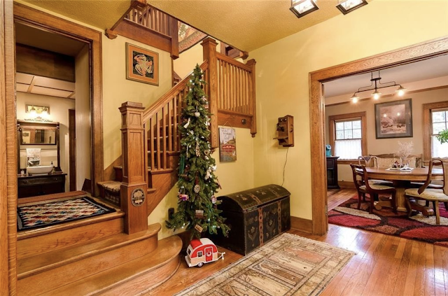
In the No. 535 model, you walk directly into the main entry hall, and you are greeted with a staircase in front of you that has a few turns in it, as it heads you up to the second floor. Here's an example, in a beautiful No. 535 in Anderson, South Carolina:
interior photo of Gordon-Van Tine model No 535 in Anderson, South Carolina, entry hall and staircase
Turned staircase of the No. 535 standard floorplan, as seen in this stunning example in Anderson, South Carolina
There is no entry vestibule area on the standard No. 535 floorplan... if you were looking at the doorway from inside the entry hall of the house, you would be looking right at the door and two square sidelights, and you would be able to see the outside directly through them... no vestibule area. Here is an example in a No. 535 in Schenectady, New York:
interior view of Gordon-Van Tine model No 535 entry door in Schenectady, NY
No. 535 standard floorplan, with its door and sidelights that look right out to the outside, with no vestibule.
This one can be seen here, in a real estate listing.
Here's that floorplan:
black and white catalog floorplan image GVT No 535
I've indicated, in blue, the area that we're analyzing here... the staircase, and entry that goes right into the hall, without a vestibule. 
In the No. 535-B floorplan, however, there is an entry vestibule, with side closets inside of it, and the staircase does not have any turn to it... it's just a straight shot, right up to the second floor. Here's the catalog's floorplan:
black and white catalog floorplan image GVT No 535B
The GVT 535-B floorplan, in the 1926 catalog, with its entry vestibule with side closets, and the straight staircase heading you upstairs, right in front of you, as you enter the front hall.

So, this is what we see in the Lansdale, PA GVT house... an entry vestibule, with doors also going to the two closets on each side of the vestibule:
color, interior photo of entry hall, looking out to vestibule and two closets in front of house
This is a perfect example of what we should see for the 535-B floorplan. The two doors on either side of the glass-front door, go to closets, and, as we can see, the center, glass-front door, looks into an entry vestibule, instead of directly outside.
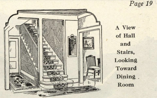
The real estate companies don't always consult us to ask what kinds of shots we need to see, to help us analyze the house (ha!), so they neglected to get a picture with a really good angle view of the staircase. But, I have two photos that give you enough of an idea of how it is situated. First, let's see how the catalog portrays the staircase area for the 535-B plan:
black and white drawing of straight staircase of 535B floorplan from Gordon-Van Tine catalog
The staircase setting of the GVT No. 535-B floorplan. There should be a maybe 2-feet wide patch of wall to one side, before you step into the dining room, and, on the other side, there should be a set-back door, with a short hallway leading to it, that leads back to the "rear hall" as it is called on this plan (the 535 plan labels that the "service hall", and some families have a butler's pantry there, or have since transformed it into a powder room).
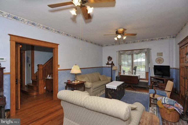
See if you can follow this plan, in these two photos from the house in Lansdale, PA:
color photo of living room and entry to staircase of 1926 West Point Pike, Lansdale, Pennsylvania • Gordon-Van Tine model No. 535-B
Here's the view from the living room, into the entry hall, where you can see the start of the staircase. This house has the flipped/reversed floorplan of what the catalog shows.
I've flipped the catalog image horizontally, for you, because the Lansdale house has the flipped/reverse floorplan from what we see in the catalog, and zoomed in to the staircase, on the real estate photo:
black and white drawing of straight staircase of 535B floorplan from Gordon-Van Tine catalog

color photo of entry to staircase 1926 West Point Pike, Lansdale, Pennsylvania • Gordon-Van Tine model No. 535-B

Perfect match! Even the two entry treads for the staircase are curved, and placed just as shown on the catalog. The only difference, is that the catalog shows a sort of floor-to-ceiling newel, instead of the regular chunky Craftsmen newel that we see here (and that probably all of the houses actually had).

The Living Room and Its Fireplace
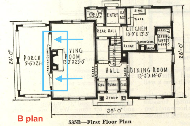
The placement of the fireplace in the living room, is different between the No. 535 plan and the No. 535-B plan. The original, 535 plan, has the fireplace on the interior wall of living room, whereas the No. 535-B plan has it on the exterior wall of the living room, the one that leads you to the first-floor sunporch. That means that the 535-B plan will have the fireplace flanked by French doors, leading to the sunporch:
black and white catalog floorplan image GVT No 535B
Here's the original, No. 535 floorplan, with fireplace indicated. The exterior wall of the living room leads you out to the side sunporch through one double-wide set of French doors, centered on that wall.
Compare that to the living room of the 535-B plan:
black and white catalog floorplan image GVT No 535B

Here we have the living room in the Lansdale, PA house, following the B floorplan, with a fireplace centered on the exterior wall of the living room, flanked by the French doors that lead out to the sunroom:
color photo of living room of 1926 West Point Pike, Lansdale, Pennsylvania • Gordon-Van Tine model No. 535-B
In reality, since this house is the reverse floorplan to the catalog, we're actually looking at the front wall of the house here, where the three front windows are. 
Upstairs
The plan for the second floor has many differences between the No. 535 and the No. 535-B plan. Again, I've flipped the plan horizontally for you, to match the orientation of the Lansdale house. 

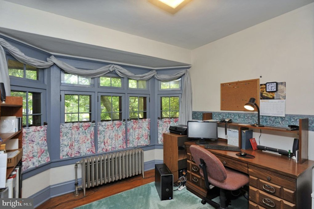
First, you'll notice that as soon as you come upstairs, you take a sharp turn, and you are in the long hallway that leads you to the center front room, the one with the big bay window. It's used in this house as an office, but it's labeled in the catalogs as a chamber (bedroom) or sewing room or dressing room (however the family chooses to use it... I've seen it used as a nursery, I've seen it used as a dressing room). 
black and white catalog floorplan image GVT No 535B

color photo of upstairs hall leading to front center bedroom of 1926 West Point Pike, Lansdale, Pennsylvania • Gordon-Van Tine model No. 535-B

color photo of front bay window room of 1926 West Point Pike, Lansdale, Pennsylvania • Gordon-Van Tine model No. 535-B
I just love this room, in this model. Windows are fabulous, and a big, wide stretch of windows in a bumped-out bay? What could be better! 
On the opposite side of the upstairs staircase, if you make a sharp turn in the other direction, when you're at the top of the stairs, you'll be headed down a very short hall, into another bedroom, and, you'll pass a built-in linen closet, which is even indicated on the floorplan:
black and white catalog floorplan image GVT No 535B

color photo of built-in closet in short hall leading to bedroom of 1926 West Point Pike, Lansdale, Pennsylvania • Gordon-Van Tine model No. 535-B
A front bedroom, with a built-in linen closet there, on the left, of the short hall.
The back bedroom is labeled on the plans as Chamber A. It is a not-very-wide bedroom, with a pair of windows looking out to the back yard of the house, a door at the deepest wall of the room that leads out to the upstairs sun porch or sleeping porch, and a door on the right, opening up into the closet:

black and white catalog floorplan image GVT No 535B
color photo of bedroom of 1926 West Point Pike, Lansdale, Pennsylvania • Gordon-Van Tine model No. 535-B
In this house, it looks like the doorway for the closet, with those louvered doors, was widened, to span the whole width.
Here's what the upstairs sleeping porch looks like, spanning the whole depth of the house, with two bedrooms opening onto it. Having those windows open, with just the screens covering the windows, would allow for lots of good air flow on a hot, summer night, which was the role of a sleeping porch:
color photo of upstairs sleeping porch of 1926 West Point Pike, Lansdale, Pennsylvania • Gordon-Van Tine model No. 535-B
Upstairs sleeping porch or sun room.
The front bedroom on the other side of the house, does not have a sleeping porch off of it, but it has four windows, allowing lots of good cross ventilation:
color photo of bedroom of 1926 West Point Pike, Lansdale, Pennsylvania • Gordon-Van Tine model No. 535-B

At some point, this house had a big closet added in on the wall next to the door, which is not shown on the original floorplan:
acolor photo of bedroom of 1926 West Point Pike, Lansdale, Pennsylvania • Gordon-Van Tine model No. 535-B
An added, large closet, in this front bedroom
Below the upstairs sleeping porch, is the first-floor sun room:
color photo of sunporch of 1926 West Point Pike, Lansdale, Pennsylvania • Gordon-Van Tine model No. 535-B

The dining room has lots of windows:
color photo of dining room of 1926 West Point Pike, Lansdale, Pennsylvania • Gordon-Van Tine model No. 535-B

color photo of dining room of 1926 West Point Pike, Lansdale, Pennsylvania • Gordon-Van Tine model No. 535-B
There's that entry hall staircase, through the French doors.
If you check out the real estate listing, you'll notice that this house has a big, modernized kitchen, and, off of it, is a large family room, that you step down into. That is an addition, in modern times, to address the sought-after aspect of having the kitchen looking out into a gathering room ... because the original plans for the house certainly don't allow for that at all. It has a nice set of windows on each side, as well as a big set of French doors to the back yard:
color photo kitchen and family room addition of 1926 West Point Pike, Lansdale, Pennsylvania • Gordon-Van Tine model No. 535-B

color photo family room addition of 1926 West Point Pike, Lansdale, Pennsylvania • Gordon-Van Tine model No. 535-B
Here's the back addition, heading you out to the back yard.
One last look at the exterior of the house, which helps you see where the addition was added on (notice the difference in the look of the foundation, under the addition):
color photo front and side view of 1926 West Point Pike, Lansdale, Pennsylvania • Gordon-Van Tine model No. 535-B

This Gordon-Van Tine model is a favorite of all of the researchers, I think. It's not one of the sweet little bungalows or cottage-style models, but it offers gracious living, with loads of big windows and beautiful, wide Craftsmen trim everywhere. No wonder we run across it in every state where we look. We've found it in numerous towns in Pennsylvania, several areas of New Jersey, lots of towns in New York State, in Ohio, in Virginia, in Wisconsin, in Oklahoma, and in more than one town in Tennessee (to see the one in Ooltewah, Tennesse, click here, and here's another, in Webster Groves, Missouri... both of these are the original, No. 535 plan, with the turned staircase).  Now, if you run across a real estate listing for one, you'll know what to look for, to see whether you've found a No. 535, or the second floorplan offered, the No. 535-B.  It always helps me solidify these floorplans in my head, when I write a blog post, so I write them as much for myself, as for others, and, especially, I just love presenting these historic gems.