 |
| Sears Winona in the 1921 catalogue |
The Sears
Winona was offered beginning in 1913, and its look, and floor plans, went through a few changes over the years. The model we ran across on Prospect Street (and there's
another on Thomas Street) is the larger version (40' deep) of the second floor plan offered. The second floor plan option was first available in 1916, but the larger version of that plan, wasn't available until 1918. Clear? No? Okay, I'll show you!
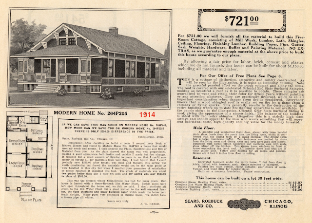
You often hear about how Sears houses were made of pre-cut framing lumber, with all of those pieces stamped with a letter/number combo (like A25, or C236), to help identify the size and placement of the piece, during construction. But, that pre-cut system did not begin until the 1916 catalogue. Until then, the kits were shipped with standard length lumber that you still had to cut to fit your plan, either on the job site, or at a lumber yard with a planing mill. So, since this model was first offered in 1913, the first three years that it was available, it was only available as a standard-lengths, not pre-cut package. Beginning in late 1916, you could opt for buying either pre-cut or not, and after that, it was only offered as a pre-cut model. It was first referred to as the No. 205, in 1913, but in 1914, most models were given a number that started with "264P...", so this became the No. 264P205. In some editions of the 1916 catalogue, it was the No. C205 (though it had 4 numbers, because it now had two floorplans, and each was offered either "not cut and fitted" or "already cut and fitted") , and in 1917, it was called the No. 264B205. Beginning in 1918, it was marketed with a word name: the Winona (however, throughout the rest of the years of the catalogues, though each model had a word name, it also had a number to refer to its floorplan[s]). The Winona remained in the Sears Modern Homes catalogues until the last issue, in 1940. There were seven different versions of the floor plan offered throughout those years... though sometimes the only difference was the length/depth of the house, to allow for a staircase in the back, to go up to a full attic. Also, some years shared the same floor plan, except for the front porch look.
 |
| You can really see how these detailed cuts, being already measured and cut, would save an enormous amount of thought and time. |
Exterior Looks
Next, let's examine the exterior look of this model. That, too, changed over the years, and had three different versions.
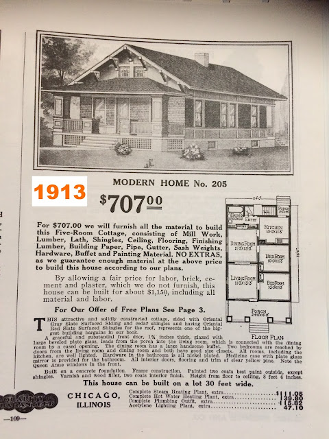
First, beginning in 1913, when it was the No. 205 model, it had two chunky front porch columns, and a series of seven brackets supporting the eaves of the roof, in front. Those brackets, at least going by the look shown in the catalog image, were 3-part brackets... like an open triangle, with all three lengths being solid pieces. This was the look that was shown in the catalogues through 1917:
 |
| Sears Winona model • 1913 through 1917 |
Here is a real-life example from this era, found by Cindy Catanzaro in -- you guessed it! -- Cincinnati, Ohio! This one is not documented, but it would be hard to imagine that it is anything else. The Hamilton Ohio County Assessor gives 1915 as the build date, and that office is usually correct with their dates:
 |
| 1915 Sears No 205 • 6518 Desmond Street, Cincinnati, Ohio |
Then, beginning in 1918, and continuing through 1926, the look is very similar, still with chunky porch columns, but the number of front eave brackets is reduced to five, and the brackets are now the trademark Sears 5-piece brackets (we usually only see these on Sears houses). The 5-piece bracket is still made in a triangular shape, but the front of the bracket system is actually two parallel pieces, making it look like the front of the brackets is open (and, you can see a center stabilizing piece poking out into the center of the bracket). The side windows are shown differently, because an additional floor plan option was added, in 1916, and this is that plan's window configuration. It's the pattern we see on the house on Prospect Street.
 |
| Sears Winona model • 1918-1926 |
 |
| Sears five-piece bracket |
And, the final look of the Winona, as shown from 1927 through 1940, is a much more modern look (for that era), with a more sleek feel to the front porch columns, and with a change from brackets to purlins, to support the front eaves of the roof. This catalogue image shows the final floor plan, which included a side bump-out (for the dining room), and two windows (on either side of the front door) on the first floor front of the house (however, even during the years when this look was offered, there was still an optional floor plan without a side bump-out, and with a pair of windows to the left of the front door ):
 |
| Sears Winona model • 1927 - 1940 |
Catalogue Pages Over The Years
Finally, let's see how the catalogue pages looked throughout the first years-- actually seeing them gives you a better sense for the differences. I'll pull out the floor plans in a more organized way a bit further down. If you're not interested in analyzing the catalogue images and the various floor plans, feel free to scroll on down to the pictures of the interior of the house.
 |
1918-- The first year with the reduced number of brackets, and the change to the 5-piece bracket.
Source: 1918 Sears Modern Homes catalogue -- larger floor plan is on the next page that year |
 |
| This is actually from my own 1920 catalogue, but you can see the same Winona pages in the 1921 catalogue, here. |
 |
| 1923 has the first bump-out version shown (source ). |
 |
| Here it is in the new version, with a change to the front porch and the brackets changed to purlins, as presented in the 1932 Sears Modern Homes catalogue, here, on Archive.org. This look was first introduced in 1927. |
The Winona Floor Plans
Here is the evolution of the floor plans. We pay close attention to the layout of the windows and doors, when we're trying to identify a Sears model.
The Chunky Front-column Years
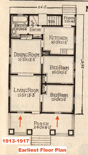
First, the floor plans when this model had those chunky front porch columns, and triangular brackets (1913-1926):
 |
This option was added in 1916, and replaced the original floor plan completely, in 1918
(when an additional, larger version was also introduced). |
 |
| In 1918, this deeper version of the floor plan was introduced, to allow for a staircase in the back of the house, to lead up to a full attic. This is the floor plan that the Prospect Street house appears to have. |
 |
In 1923, the deeper, 40' plan is completely re-imagined, adding a bump-out in the dining room.
From this point on, the 40' plan always has a bump out. |
Front Porch Changed To 3 Slimmer Columns
The bump-out version from 1927-1938/39, is the same layout as the bump-out version that was introduced in 1923, with chunky columns... only the front porch is changed, and the roof brackets are replaced with purlins (see images earlier in the blog post).
 |
| So, essentially, this floor plan, behind the front porch, is the bump-out version on all of the Winonas from 1923 onward. |
 |
| This no-bump-out floor plan is new in 1927. From the outside, we'd only be seeing the windows, and they have changed. |
 |
Here are the two non-bump-out, 36' deep versions of the Winona (post 1917), side by side.
(Click to enlarge) |
In the final catalogue, the Winona has the same two floor plans it has had since 1927, but the bump-out version was widened by a foot and a half!
 |
| Who knew!? In 1940, Sears added a foot and a half to the width of the larger floor plan for the Winona! |
Lookalike Models To The Sears Winona
We often find that there are similar-looking models to Sears models, offered by other kit companies, or by plan book companies. Sometimes, you can barely tell the difference, and you have to pay attention, on the outside, to things like the type of brackets used, or purlins vs brackets, or porch columns, or the placement of the furnace vent chimney. We always carefully check out the number and location of windows and doors. Here are a few lookalikes that we're aware of, for versions of the Sears Winona:
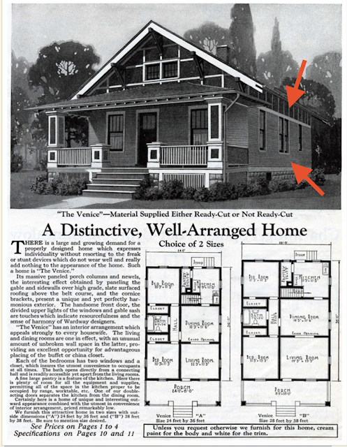
Wardway Venice
On first glance, the Wardway Venice looks like a dead ringer for the earliest versions of the Sears Winona. However, one big difference to note, is the decorative strip along the top of the sides of the house. Its stripe pattern is different than that on the Sears model, and the Sears model also has that strip on the bottom, whereas the Venice does not. This feature might be missing, on a house in the wild, that has had vinyl siding added, though. Also, though the earliest floor plan of the Winona, with chunky porch columns, did have two windows on either side of the front door, it never had that layout AND 5-piece brackets... at least, not according to what was shown in the catalogues.
 |
| The Wardway Venice model, offered beginning in 1917. This image is from the 1925 catalogue, on AntiqueHome.org. |
 |
| Early Sears Winona vs Wardway Venice (click to enlarge) |
Bennett Dover
Bennett Homes of upper New York State, also had a chunky-columns lookalike to the early Winona. However, it also had a little bump-out on the left, that is smaller than the eventual bump-out of the Winona. Also, it is missing the decorative striping on the upper and lower edges of the sides, and the brackets aren't a match to the era of Winona that had a bump-out. The size differs from the Winona, as well.
 |
| Bennett Homes Dover, see it in the 1925 catalogue here, on Daily Bungalow. |
C. L. Bowes Plan Book Model
C.L. Bowes was a publisher of plan books, of the type that a contractor or lumber yard might carry. So, they were in competition with the kit companies, and just sold plans, not building supplies. A
1918 C. L. Bowes plan book offers this model, which is very close to the earliest Sears (No. 205) version. Its floor plan is the reverse floor plan of the Sears No. 205 (the first
Winona floor plan), but... the front porch roof is supported by straight purlins, not by triangular brackets. There is a decorative bottom strip along the sides, but it's not quite the same as Sears offered, and there is not visible decorative strip along the top of the sides.
Here are the two floor plans side by side:
 |
| Window patterns are the same, but the C. L. Bowes model is supposedly 9 feet deeper than the Sears model... but, the room dimensions on the floor plan don't add up to 45! |
C.L.Bowes has another Winona lookalike, in a 1923 book of plans. This one does not have an exact match offered by Sears... but, I think that we may have some of these on our list, that are actually this C. L. Bowes model.
 |
| This is the only place where we see this floor plan... it's the Winona's non-bump out version from 1923, but WITH a bump out. Geeeeeze. Here's that 1923 C. L. Bowes plans-only catalog. |
Bump-Out Lookalikes
Both Wardway and Gordon-Van Tine offered a lookalike to the final version of the Winona, the one with the bump-out and the front porch with purlins and two windows and slimmer porch columns. In fact, the Wardway and GVT models are the same as each other, because of the working relationship between the two companies (GVT was subcontracted to provide the pre-cut lumber for the Wardway kits, so both companies offered almost all of the same models, once that relationship began).
The Wardway and GVT bump-out lookalike has two obvious differences:
- A bump-out on both sides of the house (DR and bathroom)
- A single window in the side section of the house, between the DR bump-out and the front of the house (Sears has a widely separated pair of windows there)
 |
| Brackets, instead of purlins, and an additional side bump-out. (Source) |
 |
| No brackets or purlins shown, but additional small side bump-out, like the Wardway offering. (Source) |
Back To The High Bridge Winona On Prospect Street
Here's where we take a closer look at the Sears
Winona on Prospect Street. Thanks to
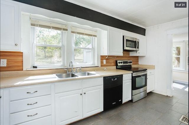
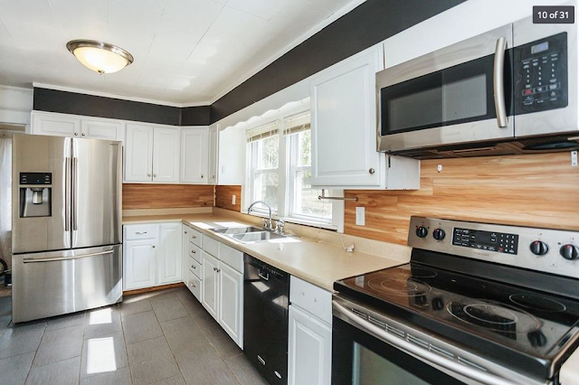
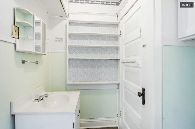
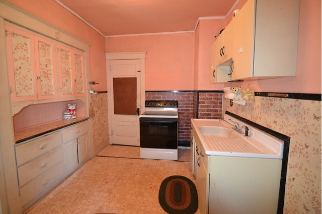
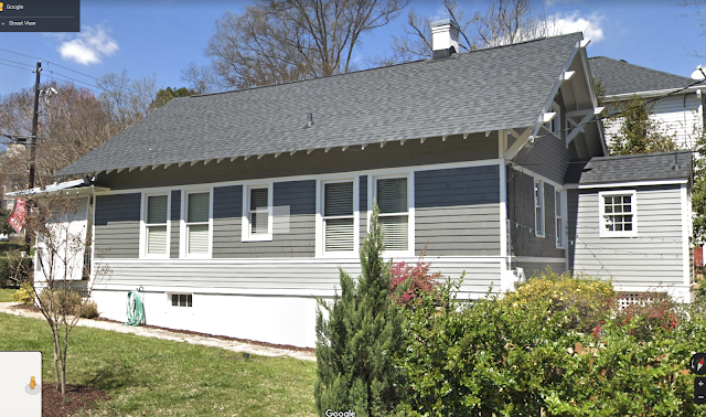
a real estate listing, we have interior photos. I believe that it follows the 40' deep 2nd floor plan, because that one allows for stairs in the back of the house, off of the kitchen, to lead up to a full-length attic, which this house appears to have. The one change we can see, is that the built-in dining room hutch that Sears shows, was placed (smartly) in the kitchen, instead, on the back wall, where there would have been a window. Also, the Prospect Street
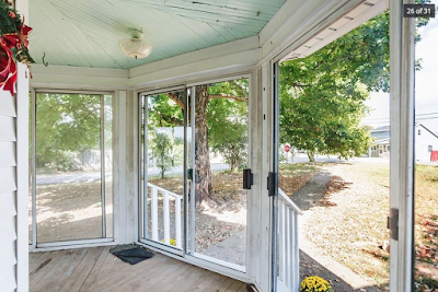
Winona has half of the front porch enclosed. Click on any of the real estate photos, to get a much larger version.
 |
| Here is that dining room area, shown in the catalogue image, above. The door leads into the kitchen. |
 |
| Here are the French doors to the side, that lead into the center hallway. |
 |
| Looking now from the back wall of the DR, into the living room, in the front of the house. At the far end, on the left wall of the living room, you see the doorway that leads to the entry vestibule in the front of the house. |
 |
| Here is the living room, looking back into the dining room. One window in LR, two windows in DR. |
 |
| So, here is that built-in hutch, placed on the back wall of the kitchen-- there should be a staircase on the other side of that wall, leading up to the attic, if you access it from the left side of the kitchen, and down to the basement, if you access it from the door that we see here. |
 |
| Looking at the floor plan, this door would normally be leading into a large pantry, and an exit door, leading to the basement steps and back porch, would normally be in that corner to the right of where the hutch is. They must have re-configured things a little bit here. That clearly looks like an entry door, and not just a pantry door. |
 |
| This is the left side wall of the house. To the right of the refrigerator is an opening that must lead to the staircase that takes you up to the attic level. The floor plan shows a window there, on the back wall of the house... we can't see the window, but we can see the sunlight coming in, so it must be there. The larger version of the second floor plan, shows the opening off of the kitchen, to be in the corner there. |
 |
| Here's the attic. There is some kind of finishing element over the rafters, and a carpet on the floor, so it must have been finished off well enough to use as living space. The larger version of the second floor plan, specifically mentions there being a useable attic space that runs the length of the house, which is why I think that's the floor plan that we have. |
 |
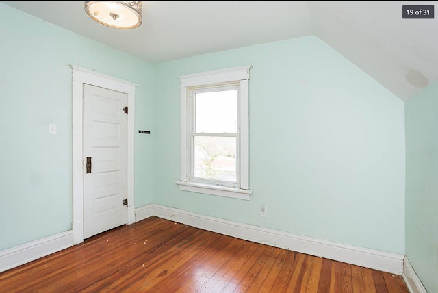
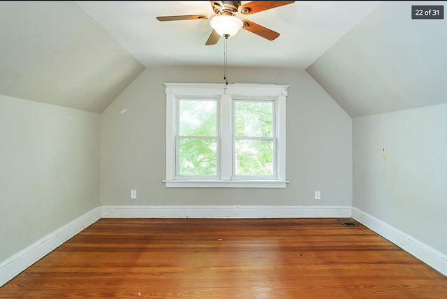
| This looks to be the front bedroom -- they are both on the right side of the house. We see the pair of windows -- there is a set in each of the two bedrooms. Sears five-part interior Craftsman style doors, and wide Craftsman trim! |
 |
| The back bedroom-- they each have a closet door in the corner, next to the pair of windows on the side wall, and a door leading in, from the short center hallway (where we are standing, here, looking in). |
 |
| This, I'm guessing, is the little room created by enclosing half of the front porch. |
And, another look at the window layout, from the exterior views:
 |
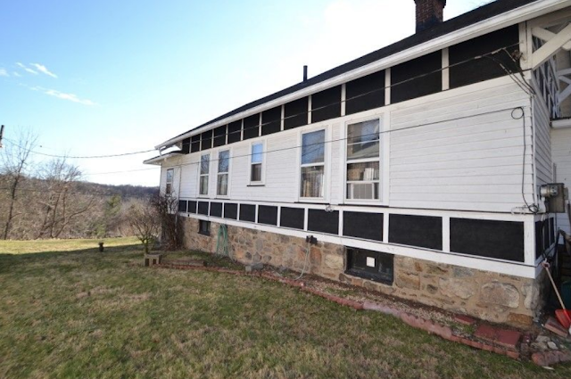
Behind the now-enclosed porch, we have the 2-1-2 window pattern.
Also, notice the decorative striped band along the top and bottom of the sides of the house. |
 |
| Chunky porch columns, and the 1-2-1 window pattern, with the back porch behind. |
 |
| Looking up at the brackets, we see the open space, showing us this is a 5-piece Sears bracket. |
 |
| The 2-1-2 window pattern, seen from the back, and, enough of a view of the back, to see that the back porch is closer to the center of the back of the house, which is correct for the larger version of the second floor plan. |
A Few Other Winonas Around The Country
Here are photos of some of the other
Winonas we've found around the country, of various floor plans.
 |
| Here's a beautiful early bump-out version, that Cindy Catanzaro blogged about, here, at Sears Houses In Ohio. |
Here's a beauty that is gone now. It was a very early Winona with an early bump-out, that did not have a pop-up roof over it. Despite its peeling paint, it's a great example of a Winona. Cindy wrote two blog posts about it, and you can access them both,
from this one.
 |
| Now-gone early Sears Winona, in Dayton, Ohio. (larger version available if you click) |
Here's a real beauty, in Raleigh, North Carolina. It was authenticated through mortgage records, and was originally bought by Oscar L. Davis and his wife, Ida May Davis, for $6,800. The placement of the two back windows in the rear view, shows us that this is the smaller version of the second floor plan.
 |
| Early Sears Winona in Raleigh, North Carolina |
Marie Vore located this one in Akron, Ohio -- smaller size of the second floor plan, with a Sears two-car Bartlett garage!
 |
| Sears Bartlett garage -- it was available as a one-car or two-car garage. |
A very early one, in Columbus, Ohio
And, finally, one of the later model, an authenticated Sears
Winona in Affton, Missouri, that had a mortgage through Sears. This is the version with the side bump-out. You can see lots of nice interior photos in
this blog post about the house.
 |
| 1930 Sears Winona, in Affton, Missouri |
This beauty in Ann Arbor, Michigan, is an authenticated example of the no-bump-out final version of the
Winona. It's perfect, and in fabulous condition! All of the windows and doors and rooms are in just the spot where they should be... just one big side dormer added. There's even a Sears Bartlett garage. The photos are from
this real estate listing.
 |
| There should be one pair of windows like this, on this version of the floor plan; this is one of the front entry doors that Sears offered in the Craftsman style. |
 |
| That big upper dormer jutting out of the roof, is a later add-on. |
 |
| The Sears Winona's smaller, no-bump-out floor plan, in the 1940 Sears Modern Homes catalog. |
And, inside:
 |
| Here's the two-panel door with Sears Stratford hardware. |


